DRY your Phoenix Templates


Modern web development has brought a lot of changes. Something I really like is breaking your templates in small components. This is something that I had a hard time to reproduce with Phoenix but I think I have now found all the small tricks to write powerful and well-structured components. I hope this will help you too.
Setup the stack
I've been working a lot with Typescript, something I like to have on all my projects. The same apply for SCSS. Finally, since we will be building components oriented templates, Tailwind fits perfectly on our front-end stack.
Phoenix 1.6 has been out for a while now, so we will setup all of this with eslint only.
First, add tailwind and dart_scss to your mix dependencies:
# ...
{:dart_sass, "~> 0.4", runtime: Mix.env() == :dev},
{:tailwind, "~> 0.1", runtime: Mix.env() == :dev},
# ...After you have installed the dependencies, you can open your assets folder and apply the following changes:
mkdir scss ts: create the folder that will host your typescript and scss filesmv js/app.js ts/phoenix_core.js: you can remove the code related to topbar but keep the remaining code since it does the setup of live views. We will insert it later on in our typescript app.echo 'import "./phoenix_core"' > ts/app.tssetup your main typescript filetouch scss/app.scss: create the entry point of your style- optional:
cat css/*.css > scss/phoenix_core.scssmigrated the existing css into a new scss file. You can then import this newly created file intoscss/app.scss - Finally, create a new file
tailwind.config.jsand another filescss/tailwind.cssand copy/paste the following code:
module.exports = {
  content: [
    '../lib/*_web/**/*.*ex',
    "./ts/**/*.{js,ts}",
  ],
  theme: {
    extend: {},
  },
  plugins: [],
}
@tailwind base;
@tailwind components;
@tailwind utilities;Note: you now have the main files for your typescript and scss. You are free to organize your typescript and style as you want.
Now you have all the correct files are the correct place, let's set up all the pipelines.
In config/config.exs , change the eslint configuration to target your typescript file instead of the initial javascript one:
config :esbuild,
  version: "0.13.5",
  default: [
    args:
      # replace js/app.js with ts/app.ts
      ~w(ts/app.ts --bundle --target=es2017 --outdir=../priv/static/assets --external:/fonts/* --external:/images/*),
    cd: Path.expand("../assets", __DIR__),
    env: %{"NODE_PATH" => Path.expand("../deps", __DIR__)}
  ]
And add the following lines right after the eslint configuration:
config :dart_sass,
  version: "1.49.0",
  default: [
    args: ~w(scss/app.scss ../priv/static/assets/app.css),
    cd: Path.expand("../assets", __DIR__)
  ]

config :tailwind,
  version: "3.0.23",
  default: [
    args: ~w(
 --config=tailwind.config.js
 --input=scss/tailwind.css
 --output=../priv/static/assets/tailwind.css
 ),
    cd: Path.expand("../assets", __DIR__)
  ]
You can see we generate 2 different css files. One containing our own scss named app.css and another one containing tailwind, named tailwind.css. So now we need to edit root.html.heex and add also insert the tailwind.css file.
<head>
	<!-- ... -->
	<link phx-track-static rel="stylesheet" href={Routes.static_path(@conn, "/assets/tailwind.css")}/>
	<link phx-track-static rel="stylesheet" href={Routes.static_path(@conn, "/assets/app.css")}/>
	<!-- ... -->
</head>We are almost there! But we need to configure the watchers to enable live reload on ts and scss edition. To do, edit the watched part of the eslint configuration available in config/dev.exs and to make it looks like the following:
  watchers: [
    esbuild: {Esbuild, :install_and_run, [:default, ~w(--sourcemap=inline --watch)]},
    tailwind: {Tailwind, :install_and_run, [:default, ~w(--watch)]},
    sass: {
      DartSass,
      :install_and_run,
      [:default, ~w(--embed-source-map --source-map-urls=absolute --watch)]
    }
]And finally, edit the deploy command to properly build all the assets when deploying your application in production. In mix.exs, edit the alias deploy to the following:
      "assets.deploy": [
        "tailwind default --minify",
        "esbuild default --minify",
        "sass default --no-source-map --style=compressed",
        "phx.digest"
]Alright! We did it ! We now have a Phoenix application with a great pipeline and no more node_modules folder!
Write faster, with Helpers
I use Helpers to write very small pieces of HTML that I use a lot. For this example, I will write some helpers that I keep in lib/app_web/helpers/. This file generates elements such as buttons and icons:
defmodule AppWeb.Helpers.Html do
  use Phoenix.HTML

  def icon(name, props \\ []),
    do:
      content_tag(
        :i,
        name,
        merge_props(props, class: "material-icons", style: "max-width: 24px;")
      )

  def button(label, type, props \\ []) do
    content_tag(
      :button,
      label,
      merge_props(props, class: get_button_class(type))
    )
  end

  def icon_button(label, type, icon, props \\ []) do
    content_tag(
      :button,
      [
        icon(icon),
        content_tag(:span, label, class: "ml-2")
      ],
      merge_props(props, class: get_button_class(type))
    )
  end

  def icon_action(title, type, icon, props \\ []) do
    content_tag(
      :button,
      [
        icon(icon)
      ],
      merge_props(props, class: get_button_class(type), title: title)
    )
  end

  defp get_button_class(type) do
    "button shadow hover:shadow-xl flex items-center pointer #{Atom.to_string(type)}"
  end

  defp merge_props(props1, props2) do
    Keyword.merge(props1, props2, fn _k, p1, p2 -> "#{p1} #{p2}" end)
  end
end
You can install material-icon as you want. And now, let's make our helpers easy to use:
In lib/app_web.ex, edit the view_helpers function and add the following line:
alias AppWeb.HelpersI like to use an alias instead of import so I can have many helpers files and there won't be any name conflicts.
Once this is done, you can test the newly created helpers. In your templates, add:
<%= Helpers.Html.icon "home" %> <!-- generate a material icon -->
<%= Helpers.Html.button "hello", :primary, class: "mt-8" %> <!-- generate a button -->
<%= Helpers.Html.icon_button gettext("delete entity"), :warn, "delete" %> <!-- generate a button with an icon -->
Of course, those are just some examples I am using. But you are free to edit/extend this file.
Do more, with components
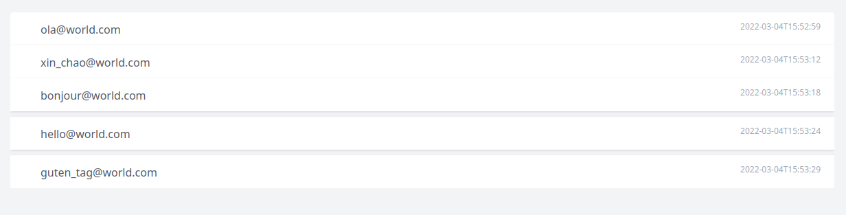
Alright. This is the exciting part of this article. Phoenix components are AMAZING. But they sure do lack some documentation. Let's see how they work by building a list that will look like this:
First, let's create a new file list.ex in a new folder named components:
defmodule AppWeb.Components.List do
	@moduledoc """
    Generate a list
    """
    use Phoenix.Component

	def list(assigns) do
    ~H"""
    <div>list is working</div>
    """
    end
endFor components to work, they need to be imported into our view. To do so, once again, edit lib/app_web.ex and add the following line to the view_helpers:
import DAASWeb.Components.{List}Note, I am using {} because you will need to add all new components you will create to this line.
Once this is done, you can invoke the list component in your template:
<.list>
</.list>
Ok, we now have the core of our components. However, we now want to send the items to the list and then define the content of the row.
defmodule AppWeb.Components.List do
	@moduledoc """
    Generate a list
    """
    use Phoenix.Component

    # we use pattern matching to make sure we receive a list of items
	def list(%{items: items} = assigns) do
    ~H"""
    <div class="rounded overflow-hidden">
    <%= for item <- @items do %>
 		<div class="bg-white shadow p-3 pl-5 pr-5 hover:mb-2 hover:mt-2 hover:shadow-l pointer transition">
        	<%= render_slot(@inner_block, item) %>
		</div>
    <% end %>
    </div>
    """
    end
endYou can see with have updated the component to add the style of our list but the most important line is this one:
<%= render_slot(@inner_block, item) %>I suggest you read the official documentation to learn more about render_slot but this example should cover most of your needs. Basically, render_slot render a piece of HEEX template. @inner_block contains the code inserted directly while declaring the components. And the second parameter, here item will be sent to the template and can be retrieved using let.
To clarify all of this here is how to invoke and use our list:
<.list items={@users} let={user}>
    <div class="flex">
        <span class="flex-grow">
        	<%= Helpers.User.name(user) %>
        </span>
		<div class="actions">
            <a href="#"><%= icon_action "send email", "email" %></a>
        </div>
    </div>
</.list>
And voila! Our list has been generated and we can reuse the list with anything since we can easily customize the template of the row.
Use your view!
Finally, any time you would copy/paste something inside your template, use your view instead! For example, my layout view contains a function menu_entry that simply.. renders a new menu entry:
defmodule AppWeb.LayoutView do
  use AppWeb, :view

  # Phoenix LiveDashboard is available only in development by default,
  # so we instruct Elixir to not warn if the dashboard route is missing.
  @compile {:no_warn_undefined, {Routes, :live_dashboard_path, 2}}

  def entry_menu(%{url: url, icon: icon, title: title} = assigns) do
    ~H"""
    <a href={url} class={get_a_class(assigns)}>
    	<%= Helpers.Html.icon icon %>
    <span class="ml-2">
    	<%= title %>
    </span>
    </a>
    """
  end

  defp get_a_class(assigns) do
    color = if Keyword.has_key?(assigns, :color), do: assigns[:color], else: "blue"

    if Keyword.has_key?(assigns, :selected) && assigns[:selected] do
      "flex justify-center block py-1 md:py-3 pl-1 pr-1 align-middle text-blue-400 no-underline border-b-2 border-white border-#{color}-400 hover:border-#{color}-400"
    else
      "flex justify-center block py-1 md:py-3 pl-1 pr-2 align-middle text-gray-500 no-underline border-b-2 border-white hover:border-#{color}-400"
    end
  end
end
and then, in my HTML:
<ul>
	<li class="mr-6 my-2 md:my-0">
		<%= entry_menu(title: gettext("dashboard"), url: Routes.index_path(@conn, :index), icon: "dashboard", color: "red") %>
	</li>
	<%= if Helpers.User.is_admin?(@current_user) do %>
		<li class="mr-6 my-2 md:my-0">
			<%= entry_menu(title: gettext("entities"), url: Routes.admin_entity_path(@conn, :index), icon: "home", color: "pink") %>
		</li>
	<% end %>
<ul>Yes, it is that easy!
Now you have all the keys to properly break down your application into small helpers and components.
If you have a problem and no one else can help. Maybe you can hire the Kalvad-Team.